
graphics degree show inspo
- em green

- Jun 14, 2018
- 3 min read
Updated: Feb 8, 2019
I thought it was about time to document my personal highlights from the NTU degree show; I've been busy working at my local newspaper hence the currently empty blog (which will soon be fixed!).
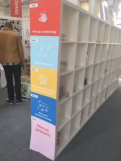
Firstly, I'll focus on the graphic design exhibit, as I resonated with a lot of projects here and feel it's best for this to have its own post. I was really impressed with the branding of the exhibition, and absolutely loved the allsorts theme. Here's hoping our theme will be just as great! I especially loved the little touches of each student stating what kind of sweet treat they'd be. The colour scheme definitely gave out a really professional but friendly atmosphere, appropriate for both younger students like myself and any professionals scouting for new talent.

One of my favourite sets of work was some posters from Sophie Lawrence. What stood out to me was the overall simplicity and strong communication of the pieces. I didn't even need to read the type to understand the subject, which really stood out to me. I really love the use of flat pattern on the curved shape as well as the colour schemes, leading to them having an impact on me from a distance.

I also really enjoyed the work of Naif Kamel. I loved the combination of typography and illustration in his work as it felt very balanced; the two elements worked together rather than fought against each other, which is something I often struggle with, so it really helped me to see it done right.
📷
Another favourite for me was the Snap Comics project; I love the message of reducing stereotypes as well as the illustration style. The use of texture in the comics, namely the light half tone shading really caught my eye as it makes the comics slightly more gritty and tangible, as well as the imperfect shape of each panel looking almost like paint rolled onto a wall. The integration of the branding onto different products also suggested to me that the designer thought about progression for the campaign.

One project that really stood out to me was A Packet of Leicester. I loved the small format of the editorial booklets and the combination of photography and type; something I personally don't work too well doing. The polished style and consistent colour scheme throughout makes the project feel like a family; and in my opinion, this was one of the most professional but energetic pieces in the exhibition. I found myself flicking through the booklets for a long time and was extremely interested in the development process of the project.
📷
The last pieces that caught my eye were from Luna Hawthorn. I was immediately drawn to her illustration style and felt that the composition of the pieces were of a professional standard too. The pastel colour palette, use of gradients and thin outlines appealed to me and the small botanical details add a mystical element to the illustrations.

All in all, I was impressed by the GD third year's work, so much that it made me feel a little nervous about trying to reach this level in just over a year's time! Their work did really inspire me and (hopefully!) gave me a glimpse into my future. I was also heavily impressed by the student's own personal branding and business cards, which has inspired me to build my own branding properly. There should be a post coming soon about that!


Comments