
d&ad festival '19
- em green

- May 25, 2019
- 5 min read
Updated: Aug 20, 2019
For the first time ever, I was given the opportunity to attend D&AD festival this year (thank you NTU Graphics department funding!) - I saw so many interesting pieces that have really inspired me in preparation for third year. Read on to see some of them...
I'd like to begin with some of the poster designs I really liked. Firstly, there were these really strong pieces for a campaign by United Way, recognising mental health, homelessness and social isolation amongst other issues mostly linked and affected by poverty. The campaign is based around the specific tone of red used throughout, named Unignorable in partnership with Pantone, with the intention that the colour cannot be missed due to its impactful nature, whether it is seen on a website, poster or t shirt. The idea of basing a whole campaign on one colour is really bold and exciting - the colour has a purpose rather than simply being used for aesthetic value. I would love to try something similar to curb my tendency to crowd designs and illustrations with a whole range of colour just because it 'looks better' that way, whereas in reality colour should really be used with intention and reason like it is here.


I actually saw a lot of work with similar neon colour palettes in the D&AD exhibitions that I really liked. For example, the Lyric Opera House posters designed by Ogilvy Chicago. I love the way the elements all overlap yet they don't feel too overcrowded - this is probably due to the white background and the body text which almost blends in to it. I love how the neon type changes in shade and tone as it overlaps the detailed cross-hatched illustrations, creating depth and interest in the piece. I particularly love the copywriting here though and the way it really captures the attention of the viewer with bold / funny statements. Copywriting is something which I feel I don't pay much attention to, but could be really good fun if I took the time to do it. It's a great way to really convey the personality of a brand in combination with colour palettes and style choices.


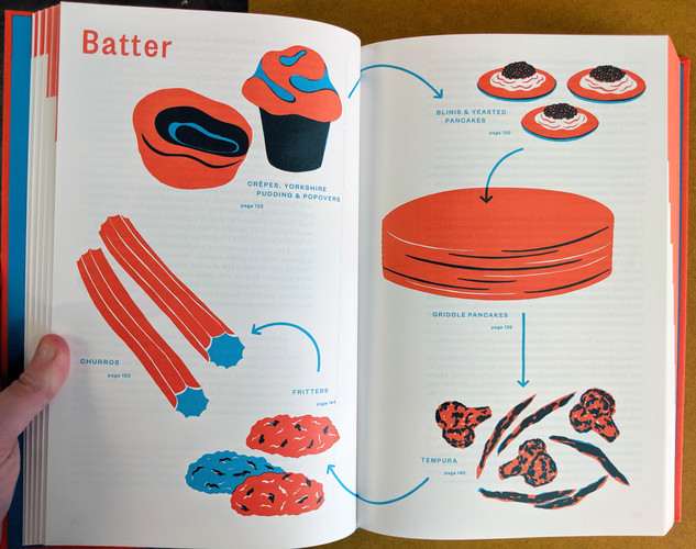
Another neon coloured piece I was drawn to was this cookbook - I really appreciate the simplicity but impactful nature of the colour palettes and typography, as well as the charming illustrations at the beginning of each section; they have really inspired me to give more experimental illustration and printmaking more of a chance as they work really well in this setting. The spine of this book is also really interesting and stuck out to me as unusual as it details all of the sections of the book in a very tiny space.


To complete the set of neon coloured designs are these FIX8 drink bottle wraps. Aside from the striking colours, I really like the collage style of the illustrations. Collage is something which I haven't really experimented much with but would really like to try in the future - maybe I could try it for a third year project! I also really like the overlapping typography on the back of the label too as it creates a lot of energy which is usually lacking on the back of bottle wraps.


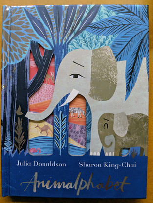
I found many more books that were of interest to me, particularly in the children's book design area. One of them was this book, Animalphabet, illustrated by Sharon King-Chai. I really love the textured illustration style as it gives the animals character and makes them feel a little more real than the pristine vector animals seen in other children's books. The interactive design of this book is what makes it really interesting though - every page has some form of cut out or flap revealing the answer to each animal related question, which are often hidden quite well. Even as an adult, I was thoroughly entertained by this book as it constantly surprises the reader at every page. This is a great example of how to be exciting and fresh in the children's book field, which can often feel a little oversaturated with books that all look and act the same.


Another favourite of mine was this gigantic book, O Gato Mais Curioso do Mundo (The Curious Cat Book in English) - with some pages made of thick foamboard, this book is another example of inventive children's book concepts. On each spread, there is something to interact with - this could be materials like fur/felt or objects like feathers and bells. Apart from this, the illustration style is bright and attractive - I really like the shades of colours used and how they interact with each other so spreads are still bright but cohesive.


Another piece which caught my eye was this jacket design for Fukt magazine's 17th issue. I love the meta-ness of this; if you look closely, you can see labels of the book's parts such as the spine, barcode, rounded corners and the front cover. I really love the simplicity of this jacket design as it uses purely typography but creates so much intrigue for the viewer. I found myself standing and reading all of the tiny labels because I found them so funny and interesting. This design creates a weird feeling and suggestion that the book is almost alive and aware of what it is , which is somehow believable even though I know it's impossible. To summarise - I love the personality of this book and would love to try something similar in the future!


My last pick from the D&AD exhibition is this manga created by the global brand Nissin, to celebrate the 60th anniversary of their monumental invention of instant noodles. The comic depicts the story of how the company came to be (though dramatised to include cowboys as you can see below), The manga was given to each of Nissin's employees in order to give them a better sense of the history of the company. I really love this concept as a way of communicating with employees in a much more fun and personal way than just sending a letter - clearly much more time and consideration has been put into this. I really love the monochrome style and the heavy shading in the illustrations to create high impact in every image, and the overly expressive nature of the characters is really entertaining. I also really liked the cover of this manga as the silver foiling and striking red work well together to create a contrasting and complex image. Overall, this is a really charming and unique piece which definitely attracted me as a love of illustration and comics.


To conclude, D&AD festival was a great experience where I found so many works and designers who have really inspired me to push my own work further to get to this level. It helped me to identify trends in the work I appreciate most (which is apparently neon colours and illustration) to steer my personal work in different directions to what I'm used to. Thanks for reading - I'll be back again soon!


Comments